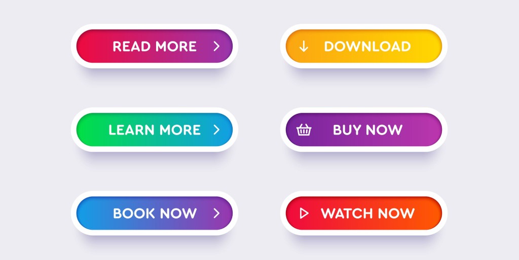
You’re reading this article because you’re tired of those boring calls to action. We got you covered!
Your marketing campaigns will only stand out if people take action. And be it a landing page or an ad copy – a call to action is pivotal for your conversion.
So why not make it more quirky and personalized?
Have you ever seen campaigns from top brands? They craft their CTA to drive the lead into their sales funnel’s next step and entice them to the purchase stage.
What Is A Call To Action?
Call to action are phrases or text prompts that help marketers tempt their audience to purchase. But, once you’re done describing your offer, a call to action tells the user about the next step if the user wants to engage with your product.
Why Call To Action Is So Important?
- It clearly states what the lead will do next to engage with the product.
- It effectively persuades the prospect and turns them into your buyer.
By the end of this article, you’ll get at least 30 call to action ideas you can reference.
Before exploring the examples, let’s start from the basics.
Call To Action Best Practices
There is no hard and fast rule for crafting a call to action. But benign in the industry for a long time, we have observed certain traits of a successful call to action.
Here Are They:
- Don’t talk about what you have. Offer how you can benefit them.
- Keep your CTA as clear as possible to avoid any misconceptions.
- If you’re planning CTA for landing pages, try to make it visually attractive.
- Time-sensitive text prompts such as “3 hours left” will work best for you.
- Refrain from adding different CTA in the same copy as it confuses the user.
- If you’re a digital marketer by heart, you know how important A/B testing is concerning the call to action. The more you test and truly recall activities, the better you’ll understand the ones working the most. (try to experiment with colors, font type, font size, etc.)
Click Here To Read Out: Spam Clicking – A Definitive Guide
30 Call-To Actions That Will Blow Your Mind
These 30 CTA examples will leave you in awe. Let’s dive in.
1. CTA: Get 30 Days Of Free Yoga
Company – Yoga International

We all love to get things for free. Yoga International took this as an opportunity and crafted its call to action.
Besides this, they added a text (No commitments. Cancel any time) to trigger the reader.
This CTA helped them to boost their conversion rate and get optimum results.
2. CTA: Get My 20%
Brand – Bombas
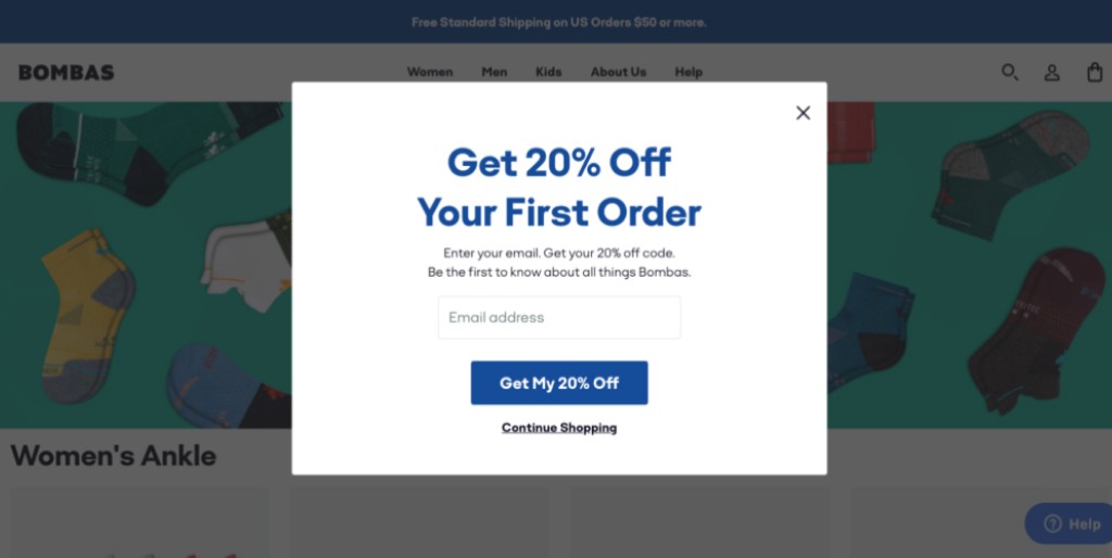
Another popular way marketers use is incentivizing readers on their first purchase.
In the following example, Bombas promised to incentivize their prospects with a 25% discount in exchange for their email id.
They used the call to action – Get My 20%.
You can take this CTA as a reference and tweak it according to your brand promise.
3. CTA: I’m In
Brand – Glossier
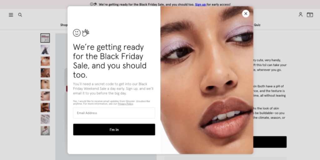
Anything that is exclusive comes with FOMO (fear of missing out). Glossier capitalized on this fact smartly.
Instead of pushing people to their newsletter, Glossier informed their prospects that they are gearing up for the exclusive black friday sale and their prospects must not miss it.
What had they done? They promised the prospects to send the “secret code” once they clicked “I’m in,.”
This worked really well. You can also think of a similar way for your brand.
4. CTA: Try 30 Days Free
Brand – Netflix

Offering a free trial is a great way to add a glimpse of your product to your potential buyers. Netflix has been doing it magnificently for a period of time.
Let’s demonstrate this example.
The call to action – Try 30 Days Free worked well for Neflix as 30 days is a good time to have a hang on your product. If they like your product, they crave more. In turn, they purchase your subscription models.
5. CTA: Shop The Stars
Brand – Etsy
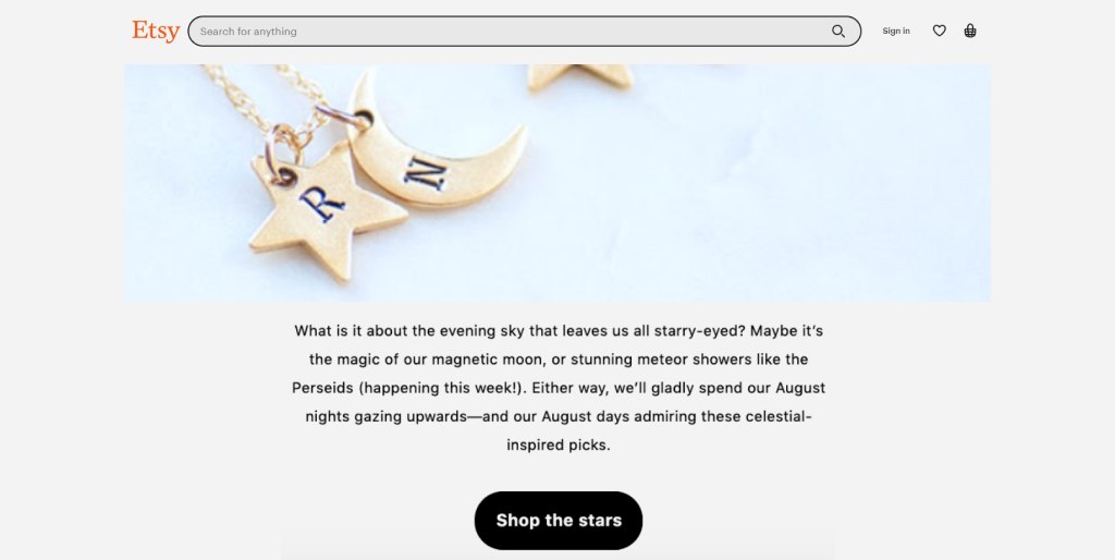
What set’s Etsy apart from others is that they never have a fear of being creative. Etsy’s call to action (Shop the stars) was quite unique, where they tried to allure people to buy their jewellery from their platform.
And Etsy took a moment to butter us up with some poetic imagery. Get your coin purse out.
Even they added poetry to make it more classy. In turn, they got amazing results.
6. CTA: Claim Offer
Brand: Hello Fresh
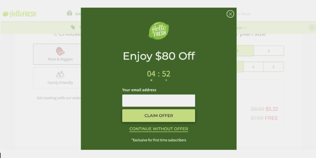
A timer invokes a sense of urgency among the users.
In this example, you’ll see that Hello used a countdown timer and added a call to action ‘claim offer”.
Adding a sense of scarcity helped them increase their sales rapidly.
Why this CTA worked?
This is simple! We get inclined towards products that aren’t easily available. The more scarce it is higher the chances of you searching for it. This is because fewer available products evoke a sense of exclusivity.
Being a brand HelloFresh knows this fact quite well. Check out below:
7. CTA: Yes: Send Me The Coupons – No: I’m Not Interested
Brand: Ugmonk
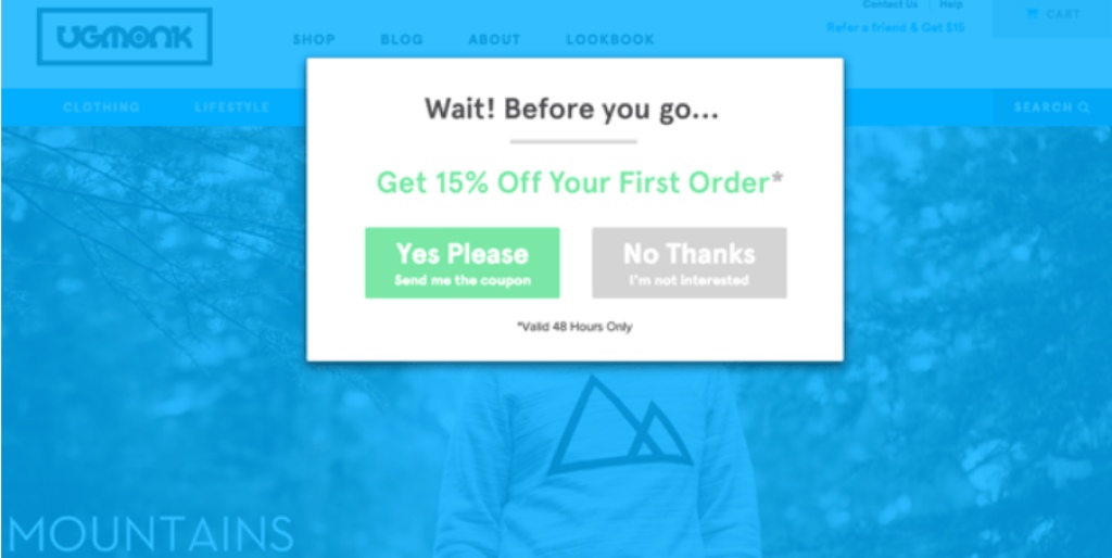
In this example, you’ll understand how an exit call to action works. Exit CTA comes into the picture when you’re about to leave a page or ad.
Ugmonk knows it well.
They offered a 15% discount followed by two CTA – “Yes Please: Send me the coupon” and “No Thanks: I’m not interested.” Most importantly, they have clearly defined their yes and no, which worked well for them because they added a reason to stay on the website.
We don’t know if you have noticed it or not – the yes button is brighter than the no button.
8. CTA: Activate Now
Brand: Green Chef

Till this point, we were mostly focusing on the pop-up CTA. Now let’s take one example from an email CTA.
Green Chef did it brilliantly. They realized that pitching a prospect to buy now doesn’t; always make sense. Rather, they thought of incentivizing the prospects to get their sales going. They used a call to action – Activate Now.
Green Chef promoted their Cyber Modal sale by incentivizing the user with free shipping and a free meal.
Once the reader clicks on the text, they will land on a page where they can practice their favourite product.
9. CTA: Create Your Set
Brand – Bobbi Brown Cosmetics

The Black Friday holiday season is the perfect time for your audience to spend more money with you.
Bobbi Brown Cosmetics knows it well, and they took this as an opportunity.
One of Bobbi Brown Cosmetics’ latest emails invited people with a call to action, “Create Your Set.“
They offered customization of a free five-piece set, which comes with two full-sized products. And that too with any $50 purchase.
It evokes curiosity and lets the user into the buying process.
If you’re planning to offer a bundle in the future, you can draw references from them.
10. CTA: Finish Checking Out
Brand: The North Face
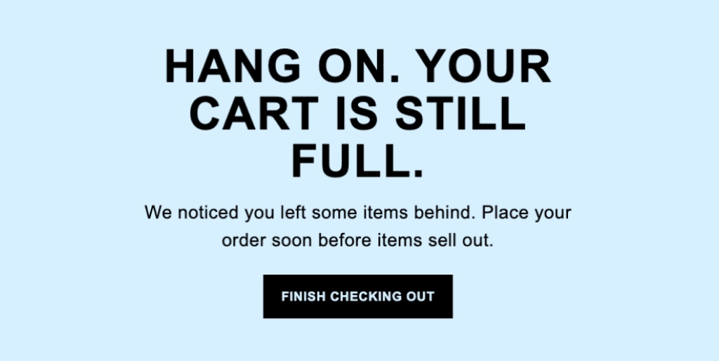
All the retailers want to stay away from cart abandonment. There might be many reasons for the same. Maybe you haven’t found a couple of codes, or maybe you found the checkout process confusing. There is another possibility that the buyer might get distracted during checkout.
In such cases, we often assume that they are not interested. But this is not the right picture. There is a chance that they need a reminder to help back on the buying journey.
In spite of offering a coupon, they sent an email and added a crystal clear call to action – finish checking out.
11. CTA: See What They Are Saying
Brand: Pagerduty

Pagerduty offers a fresh take on the CTA and highlights customer stories that are sure to capture the attention of readers.
They use descriptive words like “love” to captivate the eyeballs of someone scrolling down the page, as well as creative button copy like “See what they’re saying” that conveys a sense of curiosity.
When people are presented with a button that simply says “read more” it often fails to generate any kind of emotion. With Pagerduty’s approach, customers can see what other people have to say.
12. CTA: Shop The Look
Brand: Mac Cosmetics

Look how wonderful the call to action is. Many brands, including mac Cosmetics, are tapping into things that are trending.
This example clarifies the most. Here they incorporated a CTA – ‘shop the look’ and got amazing results.
Selling a product is okay, but selling a dream look is something that sets you apart. And this is what Mac Cosmetics knows really well.
13. CTA: Use Code…
Brand: Kiwi Co.

One of the best practices of the e-commerce sector is offering buyers a coupon code in exchange for a tier email id.
Once the user opens the email, they get their coupon code.
Let’s take an example from Kiwi Co.
In their recent holiday special email marketing campaign, Kiwi Co. added a coupon in their email that comes with a 60 percent discount for the first month.
The noticeable part is that they added the CTA as a part of their image.
14. CTA: Shop
Brand: Nike
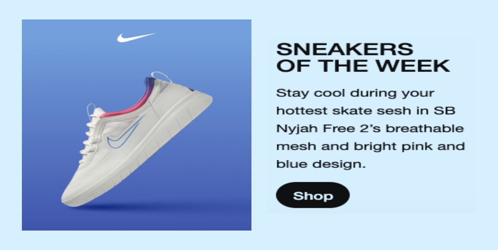
Though the call to action may sound simple, it’s quite effective in attracting the right users.
When it comes to marketing emails, it’s crucial that you add CTA at the right place. And Nike has nailed it with its call to action – Shop.
They intrigued their customers with a picture of the product and a call to action that worked well for them.
If you want to harness the power of a call to action like they did, take a look:
15. CTA: Save Now
Brand: Adobe Creative Cloud

This is another creative example where AdobeCloud encourages its prospects to make something unique.
They used a clickable button directing ‘save now.’ It implies that they offer something great that will help you save along the way.
This is a perfect example of motivation and providing incentives at the same time.
16. CTA: Get Free Socks; Refer A Friend Here
Brand: BOMBAS

This example is for those who want to explore CTA from the referral marketing genre. The noticeable fact is that they are on point from the beginning. They used that
They Have Mentioned Two Facts:
- What you have to do.
- What you will get in exchange.
To be clear from the beginning helped them to keep their users engaged. These simple email CTAs were successful, and they realized promising results.
17. CTA: Get Your Goby
Brand: Goby

This is another great example of product related call to action harnessed by Gobi.
To hook the reader, they used an engaging headline – “Maximum clean, fraction of the price.”
The beauty of this call to action is that it is not so salesy yet useful in enticing the customer to buy the product.
You think of the same pattern, and instead of using a boring call to action every time, you can tweak the language smartly.
18. CTA: Shop The Official Site
Brand: Adidas
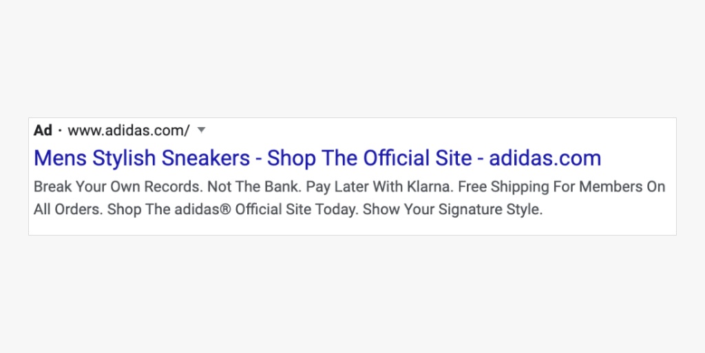
This example is helpful for those who leverage ads online. Google ads are a helpful tool for conversion, and using an effective CTA is a must-have thing.
With this call to action (shop the official site), Adidas added a touch of authenticity to their campaign.
Apart from that, it also encourages customers to take action on the product.
19. CTA: Subscribe To The Blog
Brand: Klientboost

For those who may not be familiar, Klientboost is a performance marketing organization, so it’s logical that their pop-up is exceedingly marketable. The greatest aspect of this pop-up is the down-to-earth terminology used.
Someone who is clueless about performance marketing can easily comprehend the message the company is communicating with its CTA copy: “Your marketing needs to be improved and we have the solutions ready.”
You’re presented with two options – signing up for the blog or not unless your marketing is already comparable to Schwarzenegger’s! This straightforward yet effective call to action is quite persuasive.
20. CTA: Continue With Facebook | Sign Up
Brand: Pinterest
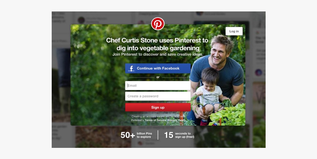
Do you want to become a member of Pinterest? You have two choices: Register with Facebook or through email.
It is clear that Pinterest prefers you to use Facebook since the blue CTA button is more visible, eye-catching, and contains the familiar logo and hue.
Furthermore, if you sign up using Facebook, Pinterest can access more data from Facebook’s API than simply entering your email address.
Here, you’ll spot a delicate CTA on the top right of this homepage designed to draw in new members. If you have a Pinterest account, you can use it to log in.
You can take reference from this CTA. Give visitors the option to sign up with Facebook or Google. This not only saves them time but also gives you more information about them.
21. CTA: Yes, Take Me There | Hmm…What’s Next?
Brand: Madewell
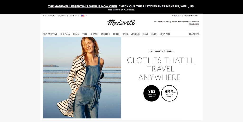
Madewell, owned by J.Crew, always steps up their website design game, and their homepage CTAs are no exception. Instead of just having a typical e-commerce website, Madewell takes it to the next level.
Upon landing on the page, you’ll be welcomed by a headline that reads “I’m Looking For…” followed by a category, such as “Clothes That’ll Travel Anywhere.” Below it are two options: “Yes, Take Me There” and “Hmm… What’s Next?” These CTAs give you a choice to either explore clothing suitable for traveling or be taken to the following category, where you can search for something else.
How can you use it? If the users aren’t quite sure what they need or how your business can be of assistance, craft engaging messages that can help guide them to their desired spot.
22. CTA: Free Instant Access
Brand: LeadPages
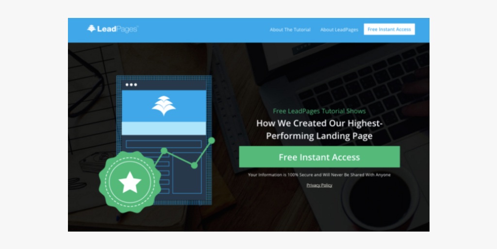
We always hear marketers saying that keeping things simple is the key to success. Leadpages has followed this principle.
Their call to action, ‘Free Instant Access,’ is so simple yet so effective.
Additionally, they incorporated some text above and below the call to action to trigger the audience.
23. CTA: Go
Brand: Buzzsumo
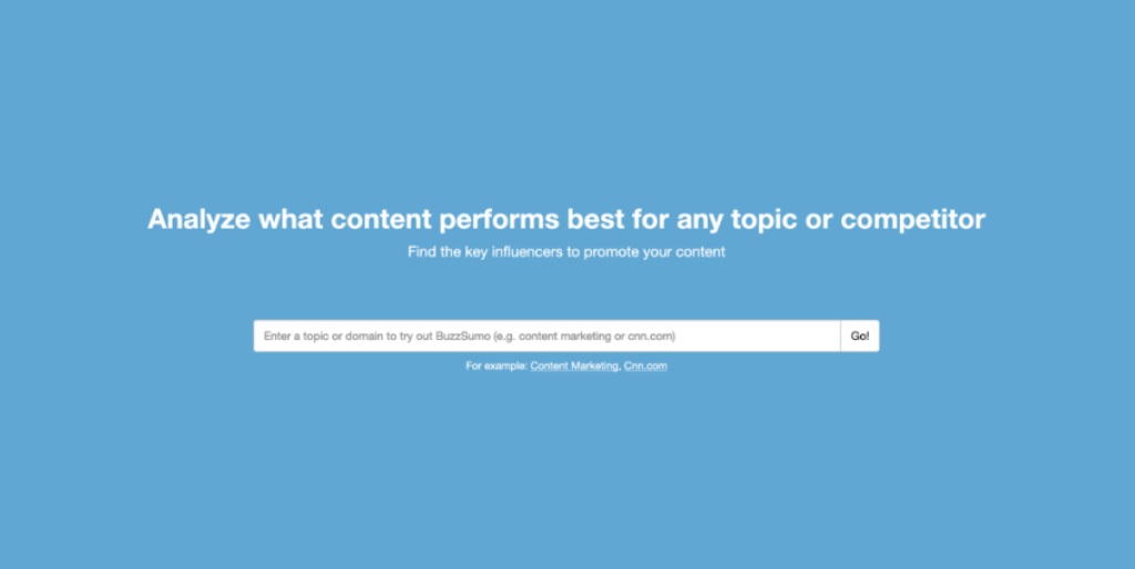
This is one of the most on-point call-to-action examples we have ever come across.
They created the call to action in an engaging way where they allowed the user to try out their product. This is really a smart move.
Imagine if the CTA was ‘explore‘ or ‘search‘ – does that even elicit the same feeling of getting the needed information quickly?
Certainly a no!
24. CTA: Let’s Do This
Brand: Kayak

For those who don’t know, Kayak is a website intended for travelers. The aim of this website is to attract travelers (especially those who love adventure and thrill.) to book an exotic holiday.
It was required to evoke a sense of spirit to do something adventurous. The CTA ‘Let’s do this’ was successful in doing the same. It evokes a nothing to lose, daring vibe, and the audience liked it a lot.
Additionally, they added some texts related to discounts. And that worked perfectly for them.
25. CTA: Get On The Guest List
Brand: Zoom
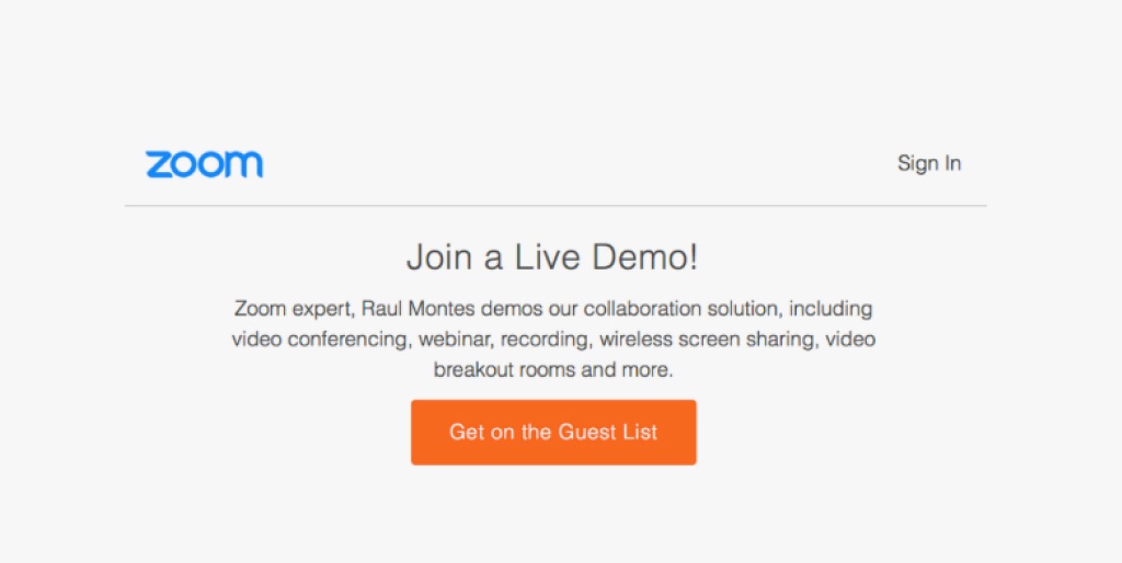
Tweaking a simple language can bring the boring text to life. This is something Zoom has done through their Call to action.
Not many companies may invest much in something as essential as their demo’s CTA, but Zoom utilizes the principles of psychology to help make their demo stand out.
Using a CTA like a “guest list” brings up feelings one does not want to miss out on, offering a simple, easy way to spice up any call to action.
26. CTA: Start For Free, Explore, And Learn
Brand: Wistia

Adding a descriptive call to action sometimes works really well.
This Wistia CTA module on their homepage is something special — it’s several effective CTAs packed up in an attractive and easily digestible format.
It’s almost too good to be true — showcasing logos from MailChimp to Casper adds a layer of authenticity that’ll make these CTAs even more compelling.
27. CTA: I Want In
Brand: AYR
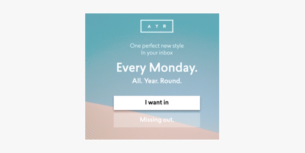
Playing with powerful words and phrases in your CTAs can strike a chord and make people feel like they’re missing out on an amazing opportunity if they don’t act.
E-commerce company AYR understands this, as humans instinctively want to be a part of something bigger, and this instinctive need is leveraged in the bold phrases they use in popups.
No one wants to feel FOMO, so this technique is a great way to capture people’s attention.
28. CTA: Discover Your Escape
Brand: Vrbo
This call to action is a perfect example of tapping into the reader’s pain points. This CTA evokes emotion and instil a sense of freedom among the readers. In turn, you start imagining yourself on holiday.
If you’re desperate for holidays, the word ‘escape‘ allures you to vacation. Plus, the term ‘discover’ tempts you to click the CTA button.
A big shout-out to Vrbo for creating a crisp yet enticing call to action.
29. CTA Button: Click To Access The Case Study
Brand: backlinkinfo

Clicking on a case study can make you feel like a big-time VIP — which Backlinko smartly suggests with the less-intimidating phrase “Click to get the info.”
30. CTA: See Our Approach And Let’s Talk
Brand: Blueleadz

Blueleadz recognizes the fact that they are not widely known to the general public.
As a result, they created the Call-To-Actions (CTAs) in such a way that it incentivizes the user to take action but still encourages them to find out more information about them.
Instead of opting for the more traditional “learn more”, Blueleadz utilized phrases such as “see our approach” or “let’s talk” which help emphasize the friendly and conversational nature of the brand, which looks to foster meaningful customer relations through listening to their needs and implementing their feedback.
Final Verdict!
The above-mentioned call to action examples are hand-picked by our experts. Take this as your reference point while crafting your future CTA.
Overall, they should also be short, informative, and ideally create a sense of urgency for a user.
A successful CTA should feature powerful copies, aesthetically pleasing visuals, and the most up-to-date psychological approaches in order to be an effective marketing element.
We hope you’ll keep the best practices in mind.
And do not forget to test and try. Who knows that you might create a high-performing call to action.
Create one! And share it with us.
Read Also:
