




At a typical trade show, several brands share one large hall, and every exhibitor wants attention.
You may have a great product, yet visitors can still walk past your booth.
In that case, the product may not be the problem. The issue could be how the booth presents it.
Sometimes, the layout is difficult to understand. The graphics may contain too much information, or freestanding signs may block important details.
That is why good booth design matters beyond appearance.
A well-planned booth can help visitors understand the brand by showing them where to look, what to engage with, and what to remember.
The layout, graphics, and demonstrations are therefore essential parts of planning a trade show exhibit.
The goal is not simply to create an expensive booth. It is to make the brand easy to notice and understand.
The following sections explain how layout, graphics, demonstration zones, visitor flow, and sightlines can work together to improve brand visibility in a real 20×30 booth environment.
Why Booth Design Matters for Brand Visibility
Visitors rarely study every booth they pass. They make quick judgments. They may notice a logo first. Then a headline. Then a product or demonstration.
Even careful 20×30 booth planning does not guarantee maximum visibility.
When developing your trade show marketing strategy and booth design, make sure visitors can answer three basic questions without speaking to a salesperson:
- Who are you?
- What do you offer?
- Why should I care?
Your booth does not have to explain every detail about your brand. However, it should create enough interest for visitors to take the next step.
That could mean watching a product demonstration, asking a question, scanning a QR code, or simply entering the booth.
The design creates the opening, while the people and content continue the conversation.
How Booth Layout, Graphics, and Demonstration Zones Highlight Brands at Trade Shows
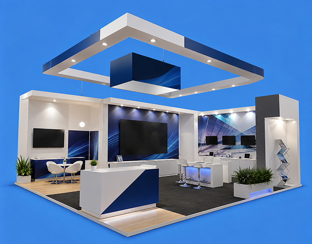
In a 20×30 booth, these elements cannot be planned separately. The layout establishes the visitor path, the graphics guide attention along that path, and the demonstration zones give visitors a reason to stop.
1. Start With the Booth Layout
The layout shapes the visitor’s experience inside the booth. It influences where people enter, what they see first, and how easily they move between the welcome, demonstration, and conversation areas.
A clear 20×30 layout should feel intuitive. Visitors should not have to work out what the booth offers, where to stand, or how to reach the next area.
The plan must also consider how its most important elements appear from each exposed aisle.
2. Create a Visual Hierarchy
Not everything inside the booth should compete for attention. If products, people, screens, and brochures all demand equal attention, visitors may not know where to look first.
A visual hierarchy gives the booth a clear order. For example, a visitor might notice the following:
- Main message
- Product or visual
- Demonstration
- Supporting information
- Next step
This order makes the booth easier to understand.
The same principle applies to the physical layout. Each element needs enough room to remain visible without disrupting movement or the viewing space around a demonstration.
3. Create Different Zones for Different Visitor Needs
A 20×30 booth does not need to function as one undivided space. Distinct zones can make the experience easier to navigate while allowing active and quieter functions to coexist.
For example, a technology company could include:
- Welcome zone: A clear introduction to the company and its main offering.
- Demonstration zone: A product or service experience.
- Conversation zone: A quieter area for detailed discussions.
- Resource zone: QR codes, brochures, reports, or other useful materials.
Each area has a different purpose. Together, they prevent the booth from becoming one crowded space where everything happens at once.
4. Make the Brand Recognizable From a Distance
Your booth should be identifiable before someone reaches it. That means your branding needs to work from the aisle.
The company name should be easy to read. The colors, imagery, and design should feel consistent with the rest of your brand.
This matters because recognition can continue after the event.
If someone visits your booth and values the experience, they might later check your website, social media, or Trustpilot ratings.
Consistent visual cues help connect those experiences.
5. Do Not Let the Logo Do All the Work
A common booth design mistake is treating the company logo as the main message. The logo tells people who you are. But it does not necessarily tell them what you do.
Visitors who already know your company may understand it. Everyone else needs context.
Pair the branding with a clear value proposition.
For example: “Company Name: Industrial Automation for High-Volume Manufacturing.” The visitor now has both pieces of information: the brand name and the problem it addresses.
6. Graphics Should Support the Visitor Journey
Think about what a visitor needs to know at each stage.
- From the aisle: What does this company do?
- Inside the booth: What does the product look like?
- During the demonstration: How does it solve my problem?
- During the conversation: Could this work for my business?
- Before leaving: What should I do next?
Your graphics should help answer those questions rather than simply decorate the space.
7. Demonstration Zones Turn Attention Into Interest
A product sitting behind glass can attract attention. Seeing it in use may create stronger interest.
That is why demonstration zones can be one of the most valuable parts of a trade show booth.
A demonstration gives visitors something to watch. More importantly, it gives them something to understand.
Instead of saying, “Our platform improves reporting,” you can show the platform producing a report.
Instead of describing a machine’s capabilities, you can demonstrate it performing a task. Instead of explaining a software feature, you can let visitors see the workflow.
The experience makes the product easier to remember.
8. Make the Demonstration Easy to Understand
A demonstration does not have to show everything. In fact, showing too much can make it less effective.
Choose one important problem. Then show how your product solves it. Suppose you developed software that reduces reporting time from two days to two minutes. Demonstrate that single improvement.
That is easier to understand than a 20-minute tour of every feature. The demonstration should answer a question the visitor actually cares about.
9. Give Demonstrations a Clear Start and Finish
A visitor should know when a demonstration is happening. They should also understand what they should take away from it. A simple structure works well:
- Problem: What is difficult today?
- Solution: What does your product change?
- Result: What improves?
- Next step: What can the visitor do if they want more information?
This turns a product demonstration into a short story. The visitor doesn’t just see a feature; they understand why it matters.
10. Do Not Make the Screen the Booth
Large screens can attract people. But a screen playing a looped corporate video is not automatically engaging.
If the content is difficult to understand without sound, visitors may walk past. If the video takes five minutes to explain the product, many people will not wait.
Use screens to support the experience by showing something that’s easy to understand quickly.
That might be:
- A product demonstration
- A short customer result
- A visual process
- A before-and-after comparison
- A live dashboard
- A product interaction
The screen should make the product easier to understand, not simply fill an empty wall.
11. Make the Demonstration Visible From the Aisle
A demonstration can create curiosity. Someone might see a machine operating or a live software demonstration and stop to find out what is happening.
This is different from a static display.
The activity itself becomes an invitation. Therefore, the demonstration zone should not automatically be placed at the back of the booth.
Where the configuration permits, position the most important action within sight of the relevant aisle without allowing spectators to block the entrance.
12. Give Visitors Room to Watch
Crowding can reduce the value of a demonstration.
If visitors are standing shoulder to shoulder around a small screen, others may decide not to join.
Provide enough space for people to approach, watch, and leave comfortably. A 20×30 layout can also provide different viewing positions when the equipment, visitor volume, accessibility requirements, and venue rules allow it.
Someone who is only curious can stand at the edge, while a more interested prospect can move closer. A qualified lead can then sit down with the team for a deeper conversation.
This creates a natural progression.
13. The Booth Should Work Even Without a Salesperson
Your sales team is important. But they cannot speak to everyone at once. That means your booth should communicate even when the team is busy. The visitor should be able to understand:
- What you offer
- Who you serve
- What problem you solve
- What makes you different
- Where to learn more
This is where layout and graphics become especially valuable. They carry part of the communication load, allowing the team to focus on conversations rather than repeating the same basic introduction to every visitor.
14. Use Interactive Elements With a Purpose
Interactive displays can be useful. But interaction should have a reason.
A touchscreen that does nothing except display your website is unlikely to create much interest. Instead, give visitors something to do, like:
- Find your biggest operational risk.
- Calculate your potential savings.
- Compare two approaches.
- See which product fits your needs.
- Test the product yourself.
The interaction becomes useful when visitors get something from it. That creates a better reason to stop.
15. Connect the Physical Experience to Digital Discovery
The booth should not be an isolated experience. Use it to direct interested visitors toward useful digital resources. A QR code could lead to:
- A product page
- A detailed demonstration
- An industry report
- A case study
- A meeting-booking page
The destination should match what the visitor just experienced.
If someone watches a product demonstration, direct them to more information about that product.
Do not send them to a generic homepage and expect them to find everything themselves. The transition should feel natural.
How 20×30 Booth Planning Can Support Brand Promotion
A 20×30 booth provides more room to coordinate visual impact, visitor engagement, traffic flow, and functional zones.
1. Enhanced Visual Impact
A 20×30 trade show booth has a nominal footprint of 600 square feet.
It may be assigned as an island, peninsula, or another configuration, so the actual exposure depends on the open sides shown on the event floor plan.
Where the venue, show rules, rigging plan, and budget permit, the footprint may support taller structures, lightboxes, or suspended signage that improve long-range visibility.
2. Better Engagement
This footprint may allow multiple staff members to hold separate conversations at the same time.
It may also provide room for hands-on hardware, interactive touchscreens, or live presentations, depending on the layout, equipment, visitor volume, accessibility needs, and venue requirements.
3. Strategic Traffic and Zoning
Within a 20×30 booth plan, separate zones can accommodate product demonstrations, client meetings, and reception activities. The exact combination should reflect the available floor area and operational requirements.
Clear internal routes can help visitors enter and move between these zones without creating avoidable bottlenecks at the aisle edge.
How Layout, Graphics, Demo Zones, Visitor Flow, Sightlines, and Brand Visibility Work Together
In a real 20×30 trade show environment, each design decision affects the others. The layout establishes the route, graphics guide attention, demo zones create focal points, and clear sightlines help visitors connect those experiences with the brand.
The table below shows how these elements work as one system rather than as isolated features.
| Design Component | Visitor Flow Impact | Sightlines Integration | Brand Visibility Role |
|---|---|---|---|
| Booth Layout | • Establishes possible entry paths from the aisle • Allocates standing and circulation space to reduce bottlenecks. • Divides the 20×30 footprint into practical zones. | • Positions important assets toward the relevant aisles. • Prevents freestanding signs from blocking internal elements. • Creates a physical order for step-by-step discovery. | • Helps answer “Who are you?” on the initial approach. • Connects the physical space with the value proposition. • Supports a coherent first impression before a salesperson joins the conversation. |
| Graphics | • Guides attention through the space. • Shows visitors the next logical action. • Signals transitions between booth zones. | • Creates an ordered visual hierarchy. • Gives the main message priority over supporting details. • Keeps essential text legible against busy visual content. | • Connects on-site visual cues with external digital channels. • Adds context to the logo by explaining the offer. • Communicates a focused value statement at a glance. |
| Demo Zones | • Can draw interested visitors inward from the aisle. • Provides defined places to watch and engage. • Creates clearer arrival and departure points around the activity. | • Establishes a focal point within the footprint. • Moves attention from distant branding to the product workflow. • Keeps product interactions visible from the intended viewing areas. | • Shows “Why should I care?” through a practical example. • Replaces passive messaging with a product experience. • Reinforces the connection between the product’s function and the brand. |
Create an Effective Trade Show Marketing Strategy That Supports Brand Visibility
Trade show visibility does not come from one large logo or an expensive booth. It comes from making the brand easy to notice, understand, experience, and remember.
That requires the design elements to work together, not as isolated parts.
The layout shapes how visitors move through the 20×30 space, while the graphics communicate the message along that route.
The demonstration gives that message a tangible form. Together, these elements can turn a passing glance into genuine interest.
The experience should also give visitors a reason to continue exploring after they leave the booth.
The layout can invite them in, the demonstration can hold their attention, and consistent brand visibility can help the conversation continue after the show.
More Resources: